Date
Overview
Image

The stripe colors show divergence from average USA temperatures from 1895-2020, top to bottom.
Graphic by Professor Ed Hawkins, University of Reading, and the UK Climate Lab, 4.0 license.
A downloadable version of this lesson is available here:
Document
Lesson – CDA Visualizing Climate Change Data.pdf
(434.38 KB)
Critical Discourse Analysis (CDA) helps readers navigate the layers of meaning packed into narrative and imagery. In a culture saturated with images that carry rhetorical power, it is essential to develop an ability to “read” visuals for their framing, the facts they imply, and the values they connote. Visuals include photographs, films, advertisements, and scientific aids like charts and graphs. Stakeholders may deploy visuals to argue for specific policy choices, but when the visuals lack context, they can mislead, conceal, and even erase other ways of seeing. Researchers use visual discourse analysis (VDA) to reveal how images mediate themes like time, truth, and power in socio-environmental (S-E) discourse. In this lesson, learners will investigate the power of climate change (CC) visualizations such as the one above, which uses the technique of climate stripes to show stark increases in global temperatures in the last 125 years. Small groups will review several distinct techniques for CC visualization for their factual, rhetorical, emotional, and aesthetic powers, and they will appraise each visual’s success in capturing public awareness and concern about CC.
Assumed Prior Knowledge
Appropriate for undergraduate, graduate, and higher-level learners.
Learning Objectives
- Analyze a series of creative approaches to visualizing climate-related datasets, like greenhouse gas concentration and sea level rise.
- Enhance learners’ critical viewing skills to support their ability to read and eventually create scientific and aesthetic visuals that serve our CC communication needs.
- Consider ways to blend quantitative and qualitative methods, and scientific, social/political, and artistic ways of understanding and communicating CC.
Key Terms/Concepts
climate change; scientific communication; visual discourse; rhetoric
The “Hook” (suggestions for quickly engaging students)
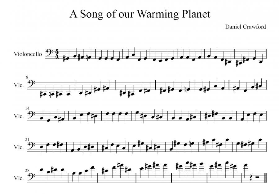
To start the session, play “A Song of Our Warming Planet” (video from 1:30 to 3:50). Don’t show the video to learners, just have them listen. Then ask what climate data they believe they’ve just heard as music. They may guess that this is the music of CO2 levels through time. Then, play the video again with the visual on view: music set to a graph of CO2 since 1880. How does the music make them feel? Does it engage their minds and emotions in a different way than a graph does?
Image
Teaching Assignments
-
As preparation for the session, have learners browse the Climate Lab Book website for 15-20 minutes, paying special attention to the links under the Visualisation Resources tab.
-
(10 min.) Open the session by reviewing the basics of discourse analysis and visualization using these lesson PPT slides.
Document -
(5 min.) Divide the class into groups of 3-5, and assign each group one of the categories in the Visualisation Resources under Observations: 1) Climate Stripes; 2) Climate Spirals; 3) Sea Level Rise; 4) Global Temperature Small Multiple Maps; 5) Keeling Curve longer context (NOAA). There are other visuals available for instructors with larger gatherings, but these five are the most relevant to this CC-based lesson. You may have multiple groups for each category.
-
(15 min.) Have each group review its visual in depth, considering its dynamics (movement) or variations (geographies). Groups should ask these questions and take notes on their answers:
What facts or statistics (logos) does this visual base its form on? Are these reliable or verifiable numbers? What agency (ethos) produced the numbers (National Oceanic and Atmospheric Administration, National Aeronautics and Space Administration, unknown)? If there are dates, what’s the rhetorical power of the historical date next to the CC state (i.e., CO2 levels)? Does anything appear misleading between the data and its artistic representation?
If the visual is dynamic, how does that movement engage the viewer compared to a static visual graph like the Keeling Curve?
What emotions (pathos) does the visual inspire in viewers? Does the aesthetic (beauty, terror, sublime) contribute to the overall experience of the visual? Does the visual feel personal?
How effective overall is this visual in demonstrating facts and inspiring emotions?
-
(15 min.) Finish class by inviting each group to share their visual and their responses to the questions above (2-4 min each). Have the class vote on an overall favorite new approach to CC visualization.
-
(If this is a 75-minute class…) Now invite groups to explore the other resources on the page. The weather of 2015 is a mesmerizing, narrated 8-minute sequence worth viewing as a group (look especially for oceanic storms and the rainclouds seeded by the Brazilian and Congolese rainforests). Instructors may also direct learners to the “Artistic” entries for visual art (Jill Pelto).
Background Information for the Instructor
-
Visualizing Climate Data
This web resource from the National Oceanic and Atmospheric Administration (NOAA) provides easy access to software that maps climate change along a number of different gradients. NOAA enables the user’s exploration of satellite-derived datasets for wind speed, coral bleaching, ice cover, vegetation, precipitation, and views of Earth at night, among others. This is an excellent starting point for climate modeling.
National Oceanic and Atmospheric Administration. (n.d.). Visualizing Climate Data. https://www.climate.gov/maps-data/climate-data-primer/visualizing-climate-data
-
New Climate Data Visualisations, 2021
This web resource from the International Peace Institute rounds up the latest techniques for converting massive reams of data into digestible visuals. Their work includes maps of Europe’s temperature trends, hydroelectricity production, and national commitments to reduce greenhouse gasses.
Florea, N. (2021, December 15.) New Climate Data Visualizations, 2021. https://theglobalobservatory.org/2021/12/new-climate-data-visualizations-2021/
-
Library Guide: Climate Change
This webpage from the University of British Columbia surveys techniques of data visualization including climate infographics, sea ice maps, and emissions vs. vulnerability to CC by nation. It provides links centered on Canadian and global datasets from the United Nations and Intergovernmental Panel on Climate Change.
The University of British Columbia Library. (2023, April 3). Research Guides: Climate Change: Data Sources & Visualizations. https://guides.library.ubc.ca/climate/data
-
Climate Visuals
This web-based climate outreach project has a massive library of images that are freely available to registered students and educators. The curators aim to increase the diversity of human representation and the impact of CC on global populations. Ocean imagery is a specialty.
Climate Visuals. (n.d.). Home Page. https://climatevisuals.org
Share